Creating a flexible attribution system
When TBS came to us for a rebrand, we needed to find a way to express their fun, honest, premium identity with a design system that would allow the brand to stretch in all sorts of exciting new directions.
So in my mind, the creative challenge was: How can we reinvent this brand to move beyond a traditional, linear broadcast TV identity to a brand that is active and entertaining everywhere our audience is active—and gets recognition without getting in the way?
A Flexible Container
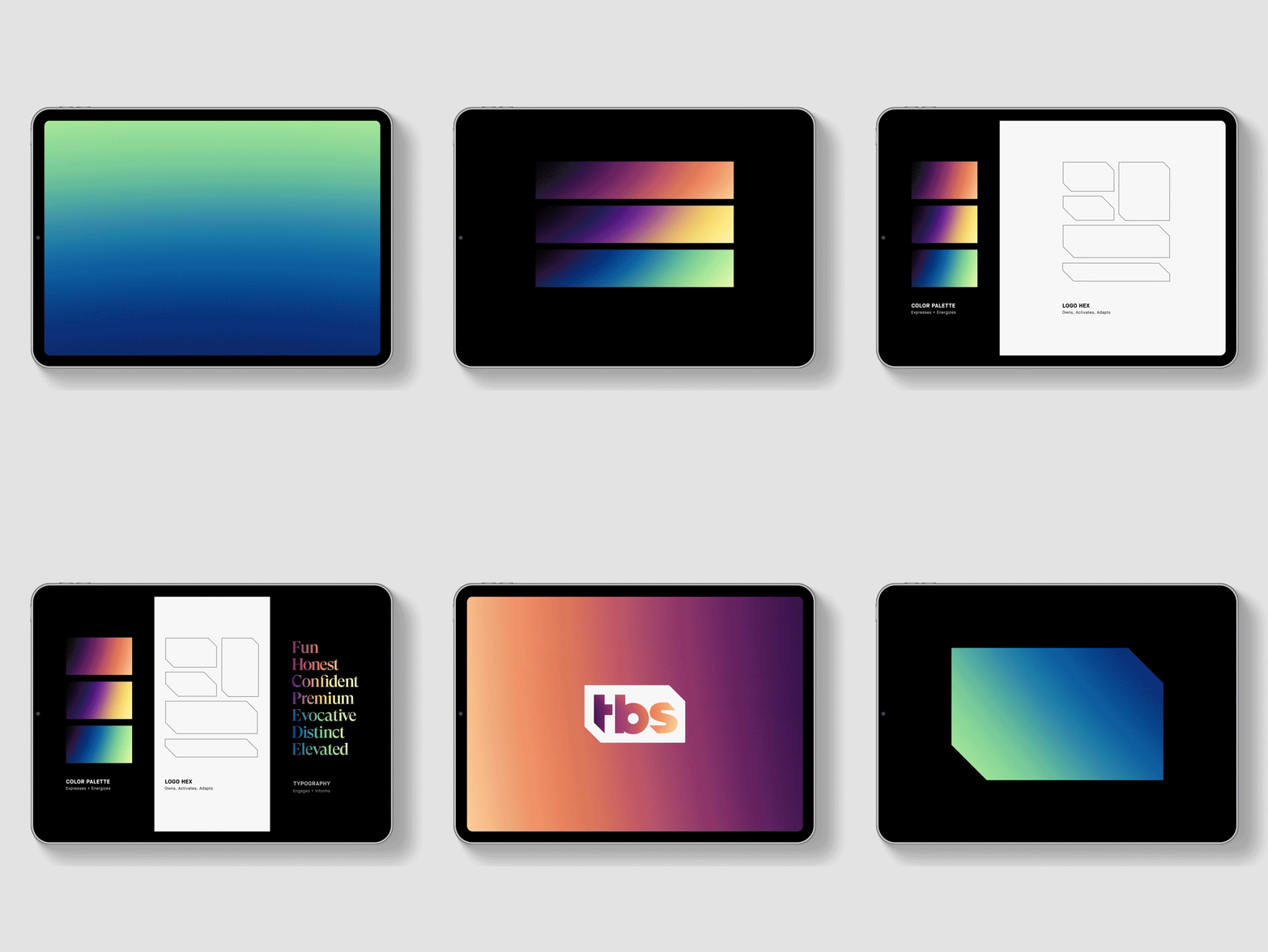
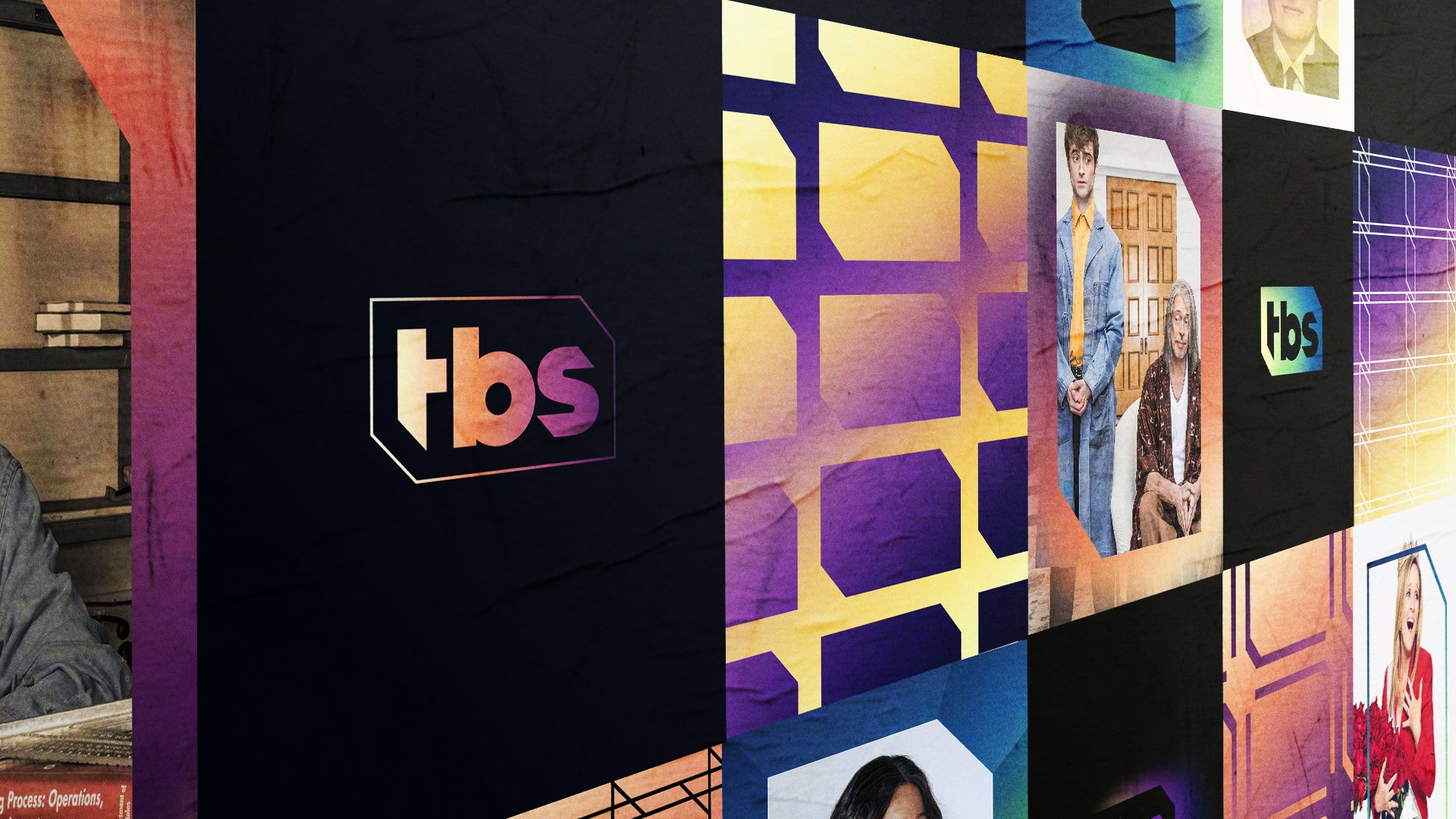
As design director, I deconstructed the logo into an abstract shape to unlock an expressive icon that flexes depending on the communication needs and the tone of the programming.
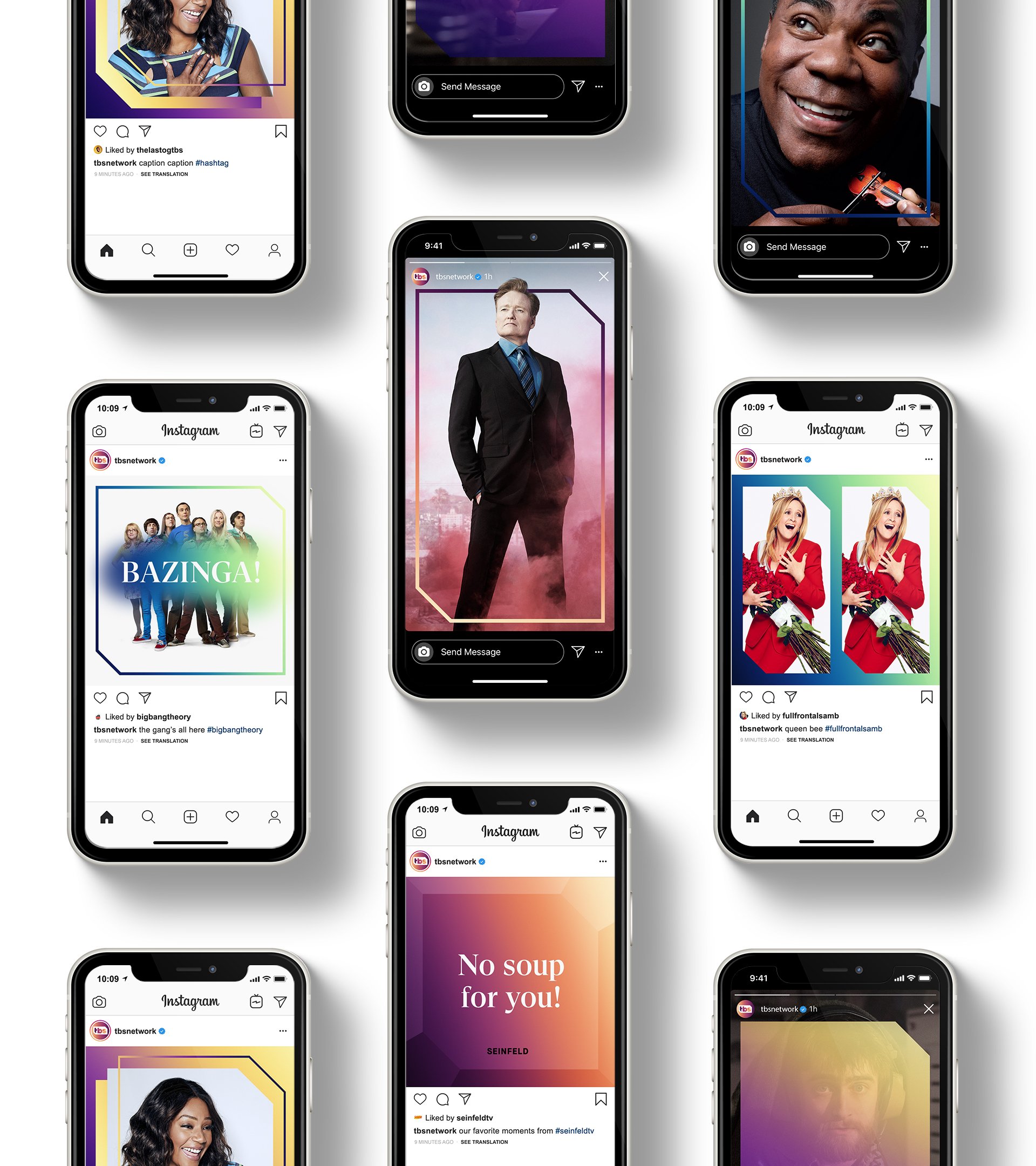
We created a complete visual identity system, reinventing every element to be dynamic, but also unique and ownable. To create a design system that can flex for different genres and touchpoints, while not making itself the center of attention.
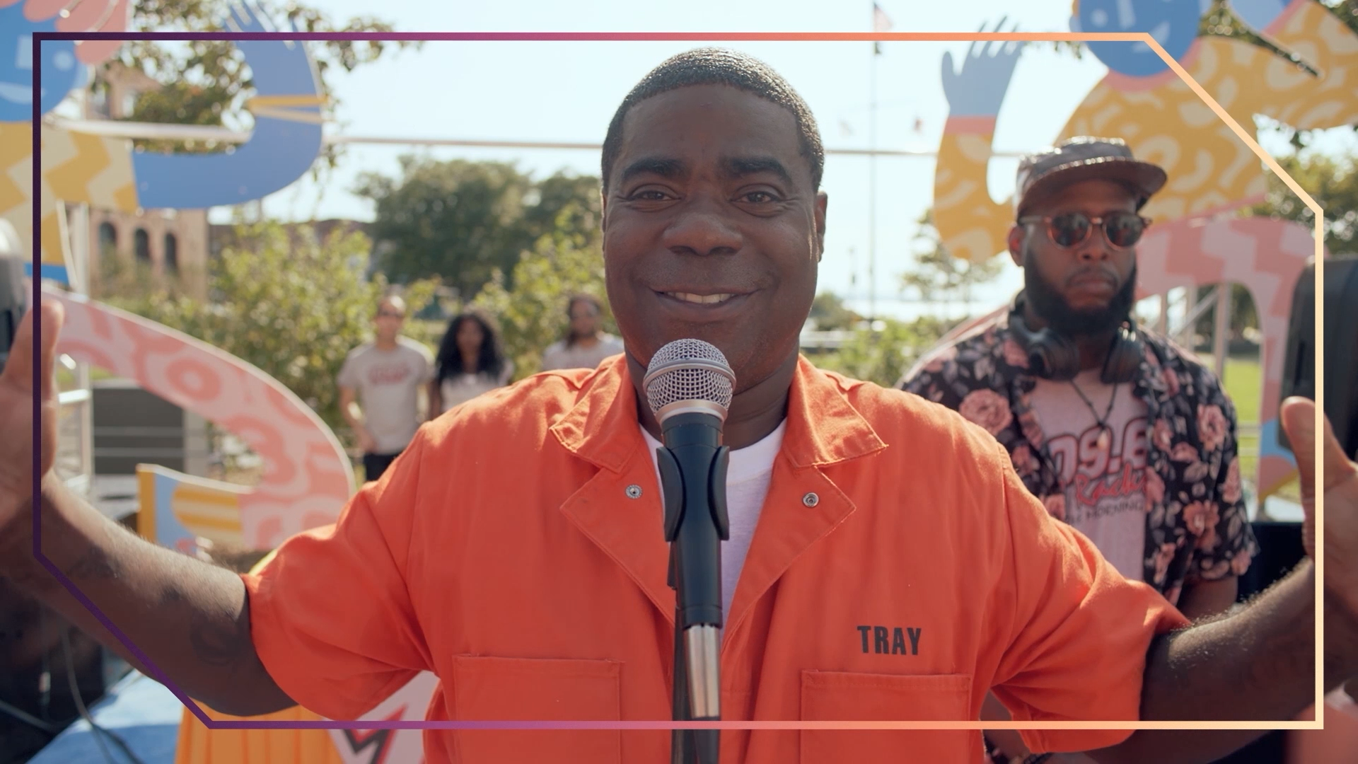
From elegant and comedic to fast-paced and punchy, the new motion language gives the brand even more expressive flexibility. A system of animated light and patterns allow the unlocked logo shape to be used as a container for content, creating clear brand attribution even when the logotype isn’t present.



Expandable Identity
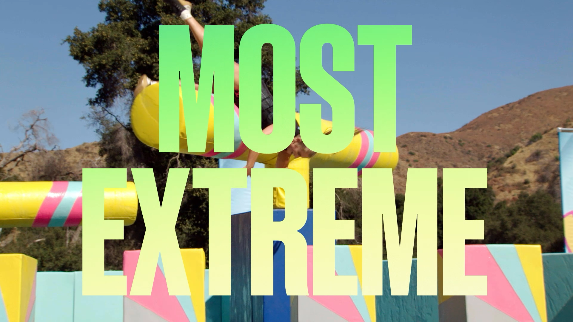
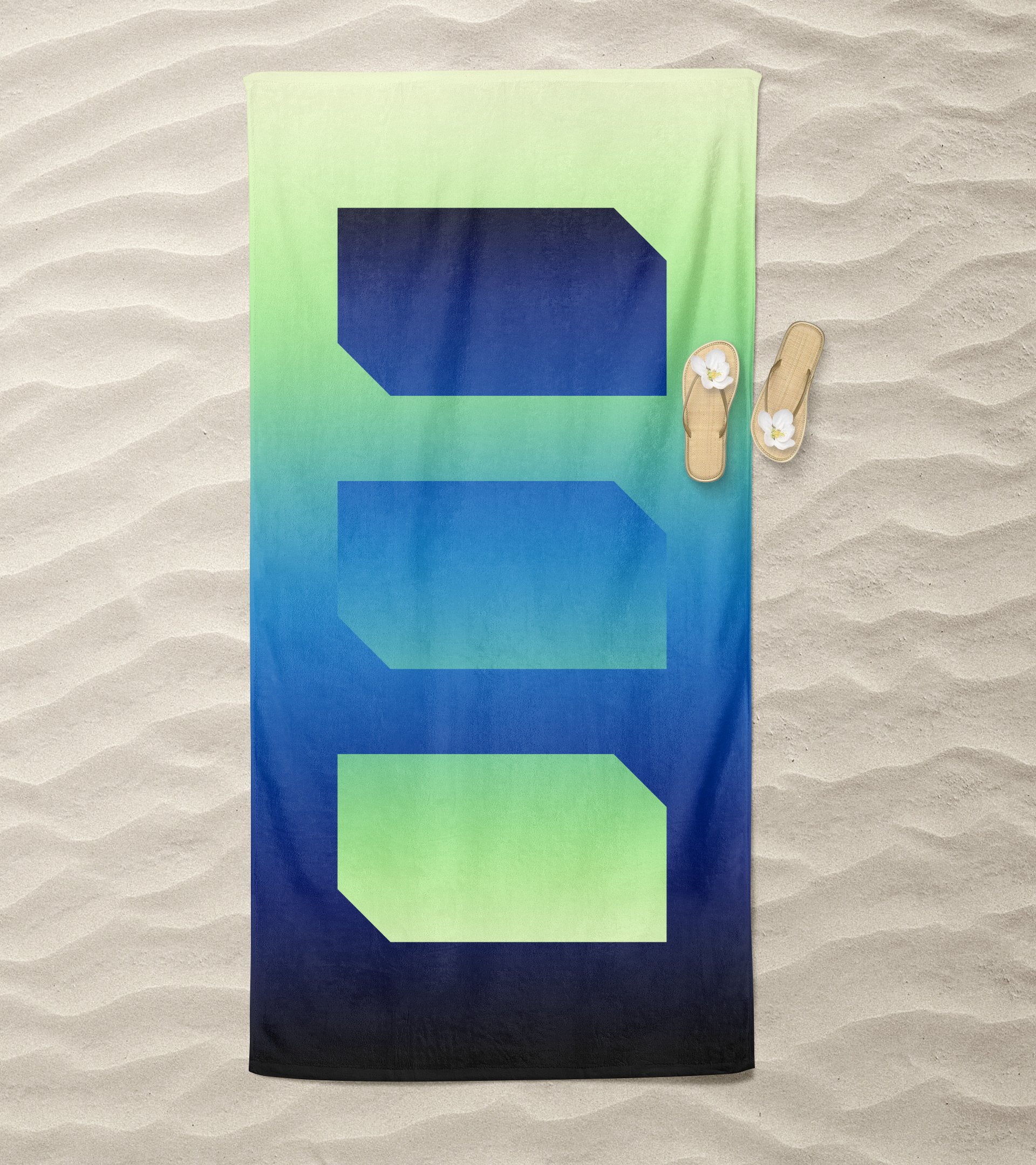
After the successful brand refresh, TBS doubled down on high-energy, unscripted programming with a new slate of competition, variety, and latenight shows. Even though the identity of the network evolved, we were still able to flex our TBS brand design system with a high-energy update of outrageous color gradients, giant typography, and wildly expressive motion language to add new dimensions to TBS’s visual identity. We helped TBS hit big with its new lineup, improving ratings 14% over the previous year in cable prime-time, while differentiating its role within the TimeWarner brand family.
